ChartGen AI: Turn Excel into McKinsey-level Charts in Just 10 Seconds
2026-01-28 | Product Hunt | Official Site | ChartGen
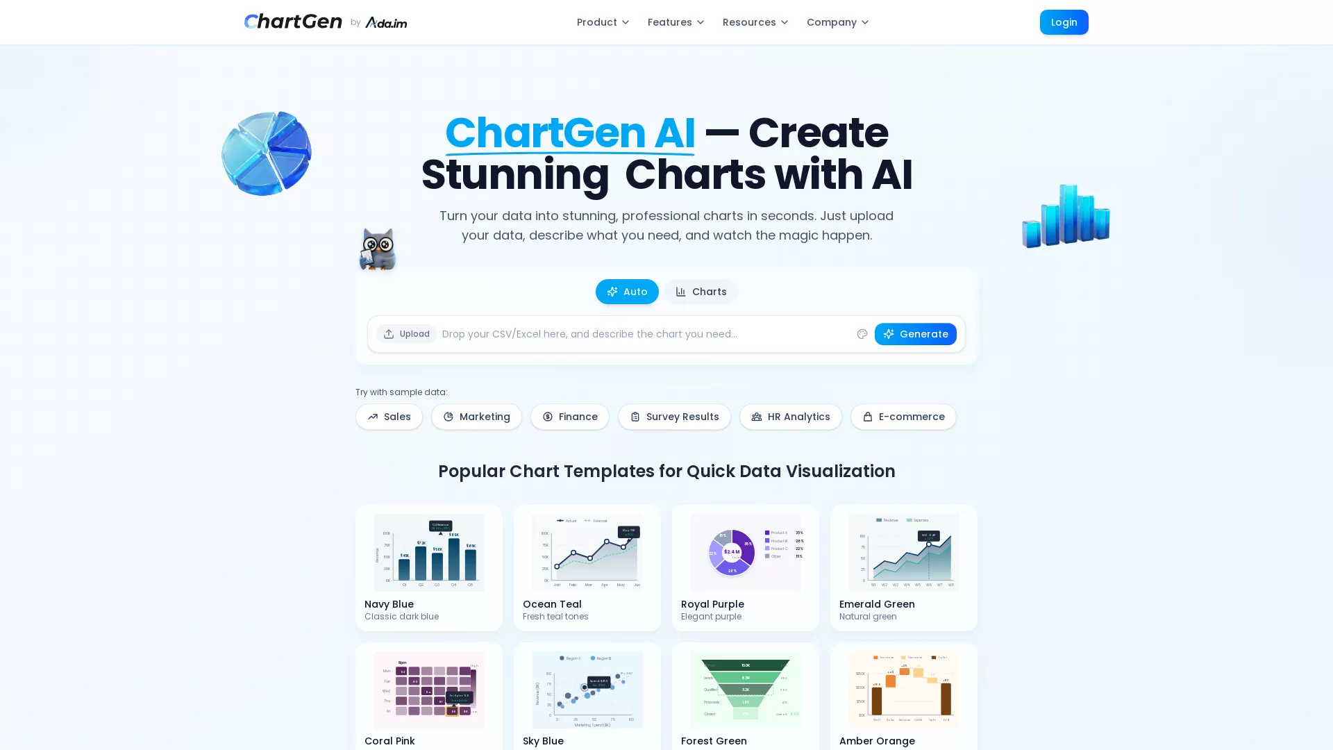
Interface Breakdown: ChartGen's UI is minimalist—upload CSV/Excel, describe the chart you want in one sentence, click Generate, and you're done. It supports preset scenarios like Sales, Marketing, and Finance, with 8 color themes to choose from.
30-Second Quick Judgment
What it does: Upload a data file + type a one-sentence description = AI automatically generates professional charts (9 types including bar, line, pie, and heatmaps) ready for your PPT.
Is it worth your attention?: Yes. If you frequently create data reports but hate wrestling with Excel charts, this tool will save you massive amounts of time. The free version offers 50 charts/month, which is plenty for individual users.
Comparison: Competitors include Julius AI (more focused on statistical analysis) and Napkin AI (focused on enterprise automation). ChartGen focuses purely on "speed to chart," making it simpler and more direct.
Three Questions That Matter
Is this for me?
Target User Persona:
- Professionals needing data reports (Sales, Marketing, Ops)
- Analysts who want to skip advanced Excel functions
- Students needing quick charts for presentations
- Anyone who wants data to look good without design skills
Am I the target?: If you often face the scenario where "the boss wants a chart of this data by tomorrow," you are the target user.
When to use it:
- Quarterly reports needing sales trends → Use this
- Marketing campaign performance analysis → Use this
- Just trying to understand the distribution of an Excel sheet → Use this
- Need deep statistical analysis or modeling → Not suitable, use Julius AI instead
Is it useful for me?
| Dimension | Benefit | Cost |
|---|---|---|
| Time | From 30 minutes per chart to 10 seconds | 0 (No learning curve) |
| Money | Free 50 charts/month, enough for light use | Paid for heavy users (pricing unannounced) |
| Effort | No more wondering "which chart is best for this data" | Need to organize data into CSV/Excel |
ROI Judgment: If you make 2+ data charts a week, it's absolutely worth signing up. It's free to register with no barrier to entry.
Is it a delight to use?
The "Wow" Factors:
- Instant Charts: Upload → Describe → Generate; it really only takes seconds.
- McKinsey Style: 12 color themes ensure the output looks professional enough for any PPT.
- Natural Language: Just type "I want a sales trend chart by month" in plain English.
The "Aha!" Moment:
"OMG it creates charts so fast, it's amazing!" — User Feedback "Presentation-ready without any tweaking" — McKinsey-style charts right out of the box.
Real User Reviews:
Positive: "Turn messy data into beautiful charts instantly." — @Yiseoha (Twitter) Positive: "ChartGen AI represents a disruptive innovation in data visualization" — @BestAIToolFind
For Independent Developers
Tech Stack
- Frontend: Modern Web App (likely React/Vue)
- Backend: Singapore-based servers, Python for data processing
- AI/Model: LLM for natural language understanding + automated chart type selection and aggregation
- Infrastructure: SOC 2 compliant, no permanent data storage
Core Implementation
User uploads CSV/Excel → AI auto-detects column types (Date, Numeric, Categorical) → Selects chart type based on natural language description → Automatically calculates aggregations (Sum/Avg/Count/Min/Max) → Renders professional charts.
Key technical points: Natural language understanding + data type inference + intelligent chart selection. This logic can be replicated using GPT-4 API + Python visualization libraries (like Plotly or ECharts).
Open Source Status
- Is it open source?: No, it's a closed-source commercial product.
- Similar open-source projects: chart-gen (OpenAI Code Interpreter version)
- Build difficulty: Medium. An MVP could be built in 2-3 person-months. The challenge lies in chart aesthetics and supporting a wide variety of chart types.
Business Model
- Monetization: Freemium (Free + Paid subscription)
- Pricing: Free 50 charts/month; paid version unlocks more export formats (SVG, PDF) and team collaboration.
- User Base: Ada.im overall has $1.1M ARR (2025) with a 10-person team.
Giant Risk
Medium. Excel might build similar features, but Microsoft moves slowly. Google Sheets might too. As a standalone tool, ChartGen’s advantage is its focus and speed. It's safe in the short term.
For Product Managers
Pain Point Analysis
- Problem solved: Creating data charts takes too long; Excel is complex and the results are often ugly.
- Severity: High frequency (almost every report needs a chart), moderate necessity (you can live without it, but efficiency skyrockets with it).
User Persona
- Primary Users: Marketing/Sales/Ops analysts, SMB owners, students.
- Scenarios: Weekly/monthly/quarterly reports, project reviews, fundraising pitch decks.
Feature Breakdown
| Feature | Type | Description |
|---|---|---|
| Natural Language Chart Gen | Core | The main selling point |
| 9 Chart Types | Core | Covers 90% of use cases |
| 12 Color Themes | Core | McKinsey-style aesthetics |
| Multi-source Connection | Core | CSV/Excel/Google Sheets |
| PNG/SVG/PDF Export | Delighter | Paid feature |
| Team Collaboration | Delighter | Enterprise feature |
Competitive Differentiation
| vs | ChartGen AI | Julius AI | Napkin AI |
|---|---|---|---|
| Core Positioning | Fast Charting | Statistical Analysis | Enterprise Automation |
| Learning Curve | Near Zero | Low | Medium |
| Code Transparency | None | Shows Python | None |
| Pricing | Free 50/mo | Limited Free | Enterprise Pricing |
| Best For | Quick Reports | Data Analysts | Enterprise Workflows |
Key Takeaways
- Extreme Simplification: Do one thing (charting) and do it perfectly.
- Preset Templates: McKinsey-style palettes reduce user decision fatigue.
- Progressive Monetization: Free version is useful enough to hook users; paid version unlocks advanced features.
For Tech Bloggers
Founder Story
- Founders: Steven Cen (@StevenCen75554), Kenny Li (@kennyli2026)
- Background: Singapore-based team, founded Ada.im in 2025.
- The "Why": They noticed users trying to paste data into AI for charts, but text models couldn't handle it. So, they built ChartGen specifically for this.
"It took us 4 months to realize that users wanted charts, not text" — Hacker News discussion title
Points of Contention/Discussion
- Will AI replace analysts?: ChartGen is just a tool to make analysts more efficient.
- Data Privacy: They claim no permanent storage and SOC 2 compliance, but users should still be cautious with sensitive data.
- How long will it stay free?: Currently generous, but may tighten as they grow.
Hype Data
- PH Ranking: Weekly Top #3, Daily #1 (2026-01-22)
- PH Votes: 510+ votes
- Twitter Buzz: 20-30 tweets, mostly official promos with positive third-party feedback.
Content Suggestions
- Angles to write about:
- "Create McKinsey-level charts in 10 seconds with AI" (Tutorial)
- "AI Data Viz Showdown" (ChartGen vs Julius vs Napkin)
- "I used ChartGen for a week of reports: Here's my experience"
- Trending Topics: Data analysis, AI tools, productivity hacks.
For Early Adopters
Pricing Analysis
| Tier | Price | Features | Is it enough? |
|---|---|---|---|
| Free | $0 | 50 charts/mo, all types, PNG export | Enough for light users |
| Paid | Unannounced | Unlimited charts, SVG/PDF, Team collab | For heavy users |
Quick Start Guide
- Setup Time: 1 minute
- Learning Curve: Near zero
- Steps:
- Go to chartgen.ai
- Upload CSV/Excel or use sample data
- Describe the chart you want in one sentence
- Click Generate
- Download PNG or copy to your document
Pitfalls & Complaints
- File Size Limit: Currently 10MB; large datasets need pre-trimming.
- Mobile Experience: Responsive design is lacking; desktop use is recommended.
- Limited Customization: Power users might find the customization options too basic.
Security & Privacy
- Data Storage: Real-time processing, no permanent storage.
- Privacy Policy: HTTPS encrypted transmission.
- Security Audit: SOC 2 compliant.
Alternatives
| Alternative | Advantage | Disadvantage |
|---|---|---|
| Native Excel | Free, full-featured | High learning curve, ugly defaults |
| Julius AI | Strong stats, transparent code | Not focused on quick charting |
| Tableau | Enterprise-grade, powerful | Expensive, steep learning curve |
| Google Sheets | Free, easy collab | Limited chart styles |
For Investors
Market Analysis
- Market Size: AI Data Analytics market projected at $236.1B by 2033.
- Growth Rate: 29.0% CAGR.
- Drivers: Explosion of enterprise data + maturing AI tech + demand for analysis from non-technical staff.
Competitive Landscape
| Tier | Players | Positioning |
|---|---|---|
| Leaders | Tableau, Power BI | Enterprise BI |
| Mid-tier | Julius AI, Hex | AI-Augmented Analytics |
| New Entrants | ChartGen AI | Rapid Chart Generation |
Timing Analysis
- Why now?: LLM capabilities have matured enough to understand natural language charting requirements.
- Tech Maturity: High; core technology has mature existing solutions.
- Market Readiness: High; users are already accustomed to AI-assisted tools.
Team Background
- Founders: Steven Cen, Kenny Li
- Core Team: 10 people, Singapore
- Past Performance: Ada.im hit PH #1 Daily & Weekly in Sept 2024.
Funding Status
- Funding: Limited info, likely Seed or self-funded.
- Investors: Not disclosed.
- Revenue: Ada.im $1.1M ARR (2025).
Conclusion
ChartGen AI is a "small but beautiful" tool—focused on doing one thing perfectly: turning raw data into stunning charts fast.
| User Type | Recommendation |
|---|---|
| Developers | ✅ Learn from its simplification; tech barrier is low enough to replicate. |
| Product Managers | ✅ Study its minimalist design and progressive monetization. |
| Bloggers | ✅ Hype is rising; great for tutorials or comparison reviews. |
| Early Adopters | ✅ Free version is generous; worth a try with zero barrier. |
| Investors | ⚠️ Large market but fierce competition; watch the team's execution. |
Resource Links
| Resource | Link |
|---|---|
| Official Site | https://ada.im/ |
| ChartGen | https://chartgen.ai/ |
| Product Hunt | https://www.producthunt.com/products/ada-2 |
| https://x.com/ChartGenAI | |
| Founder Twitter | https://x.com/StevenCen75554 |
2026-01-28 | Trend-Tracker v7.2